Shop Local Minority Businesses!
Timeline
5 Weeks
Role
UX Researcher, UX Designer, Front-end Developer
Tools
Figma, HTML/CSS, Javascript, Bootstrap
Skills
Web Design, Front-end Development, User Interview
Overview
Problem
Our client, Center for Shared Prosperity (CSP), is an organization from Carnegie Mellon University (CMU) that aims to support the Pittsburgh community. They needed a platform for the CMU community to access a searchable database and educate student, faculty, and staff populations about the power of supporting local minority-owned businesses. The database website also needed to follow the brand toolkit of their original CSP website .
Outcome
Using the CSP brand toolkit, we created a responsive
database-searching website for the CMU community that provides
information about local minority-owned businesses in Pittsburgh
while emphasizing the importance of supporting them.
Due to time constraint, we are not able to do back-end development
such as linking the database to the website. Therefore, our final
deliverable is just a prototype showing the overall design of the
website.
End Result
Final Design Showcase
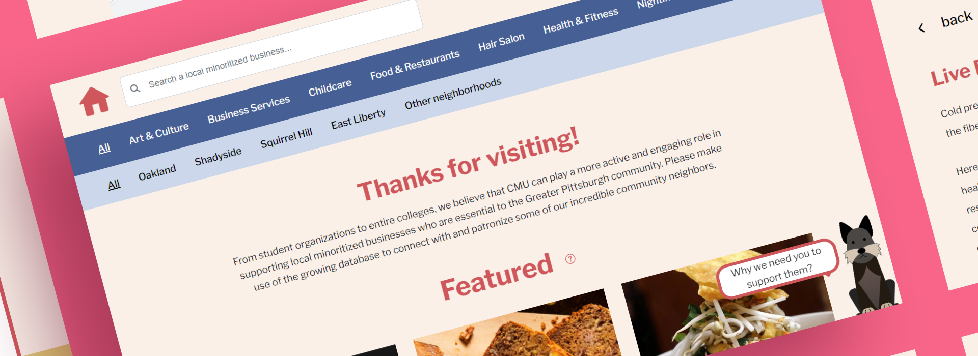
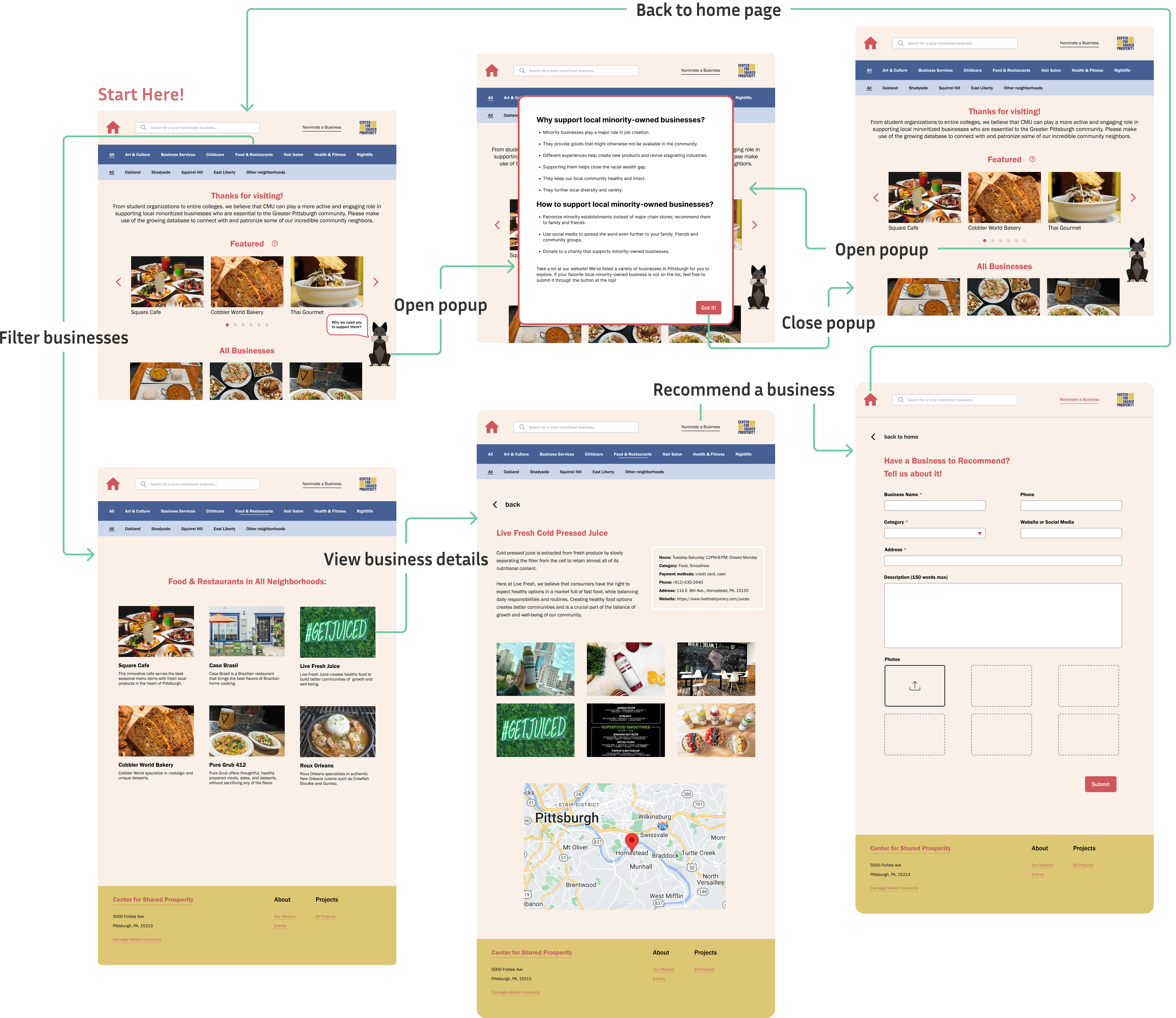
Through the communication with our client and design iterations based on user feedback, we created a responsive website that supports business searching based on categories, a popup for educating users the importance of supporting minority-owned businesses, a gallery of local businesses, and an information page for a specific business.
1. Searching
The search box and two filters allow users to easily find businesses that they are interested in.
2. Scotty Popup
If the user clicks on the cute Scottish Terrier (CMU's mascot), a window will pop up to explain the importance of supporting local minority-owned businesses.
3. Business Gallery
A list of businesses with images showing the actual environments and business names.
4. Business Details
Here, users have access to more details about the business, ranging from operating hours to its official website. Additionally, a Google Map is embedded below the photos, enabling users to effortlessly plan their route to the business location.
5. Responsive Website
The website is responsive to different devices, including desktop, tablet, and mobile. The smooth transition in layouts ensures best user experience.
Preparation
Competitive Analysis
We reviewed 3 database websites of other organizations with similar goals and website implementations to our website. We then analyzed their strengths and weaknesses to help us recognize how we can design our website.
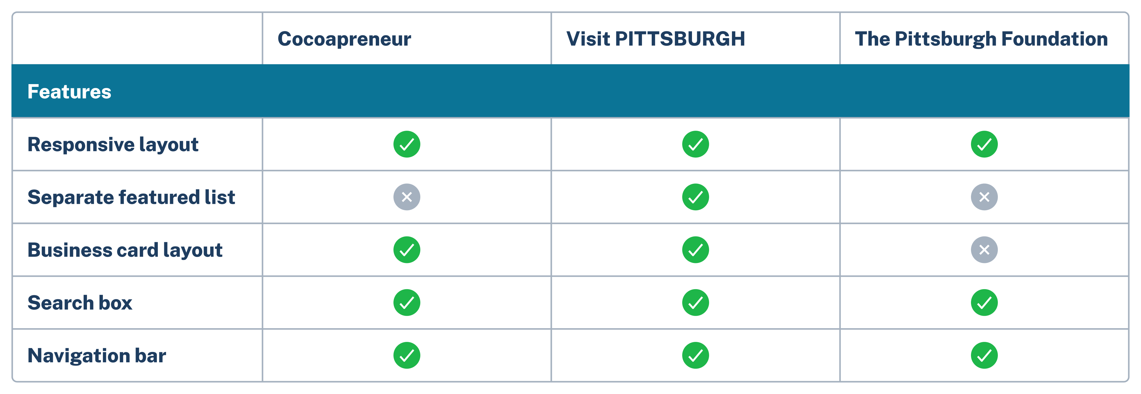
Based on competitive analysis and discussion with our client, we decided to implement a website with a search box at the top, filters based on business type and neighborhood, a carousel for a featured list, card layout for business list, and a business information page for each business. We also included a form for users to recommend a local minority-owned business on the top-right corner of the website.
One unique feature of our website is that we use a Scottish Terrier icon as a clickable popup that tells why CMU community should support local minority-owned business. This can make our users (i.e., CMU community) feel more connected with the site, as the Scottish Terrier is the official mascot of CMU.

Target Audience
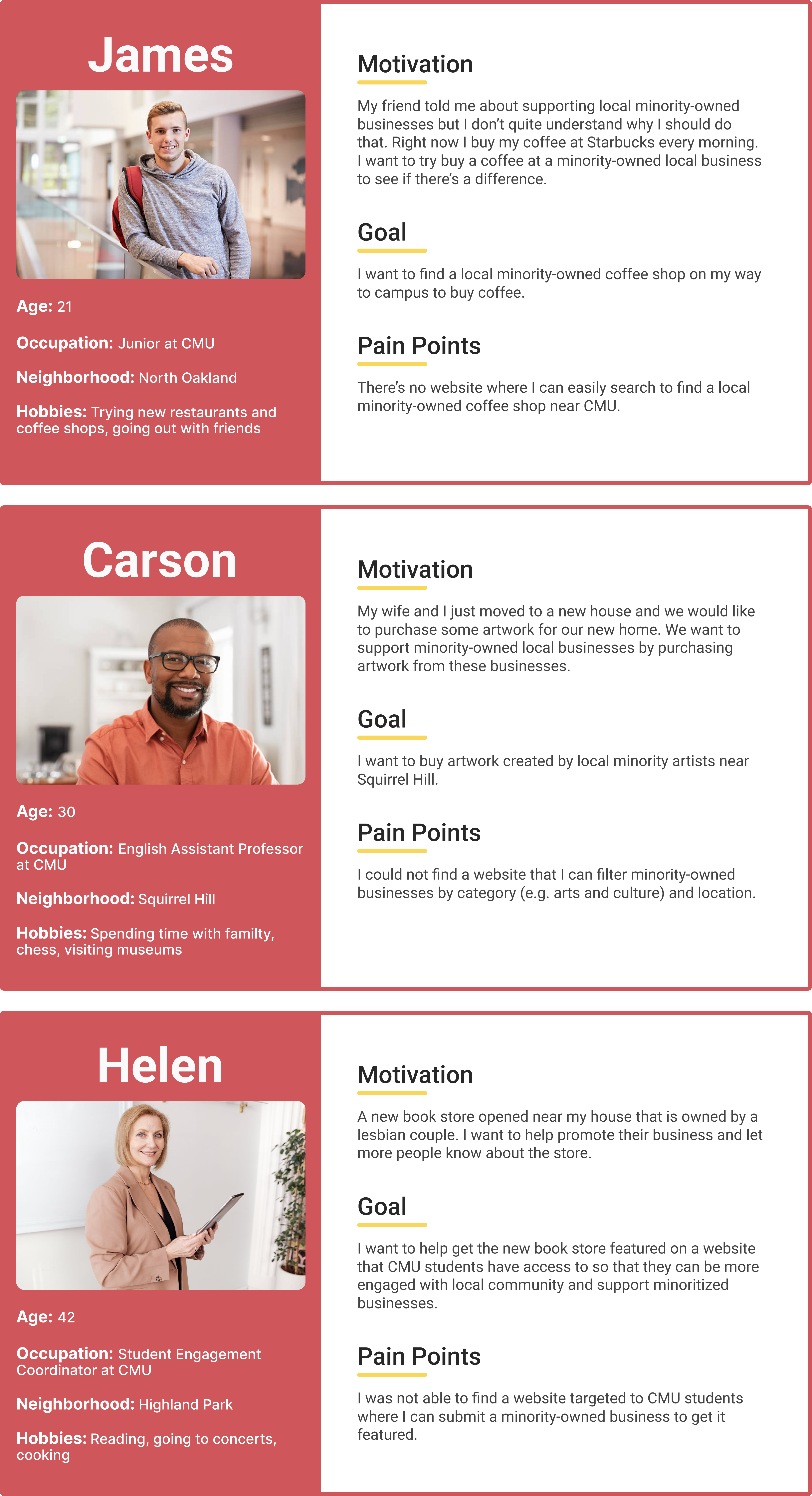
Developing Personas
We created three personas to better understand our target users. Our target audience is the CMU community, including students, faculty, and staff. Our website contains a directory of minority-owned businesses, but we expect the majority of the visitors to be potential customers of these businesses from the CMU community, not the business owners themselves.
Lo-fi Wireframes
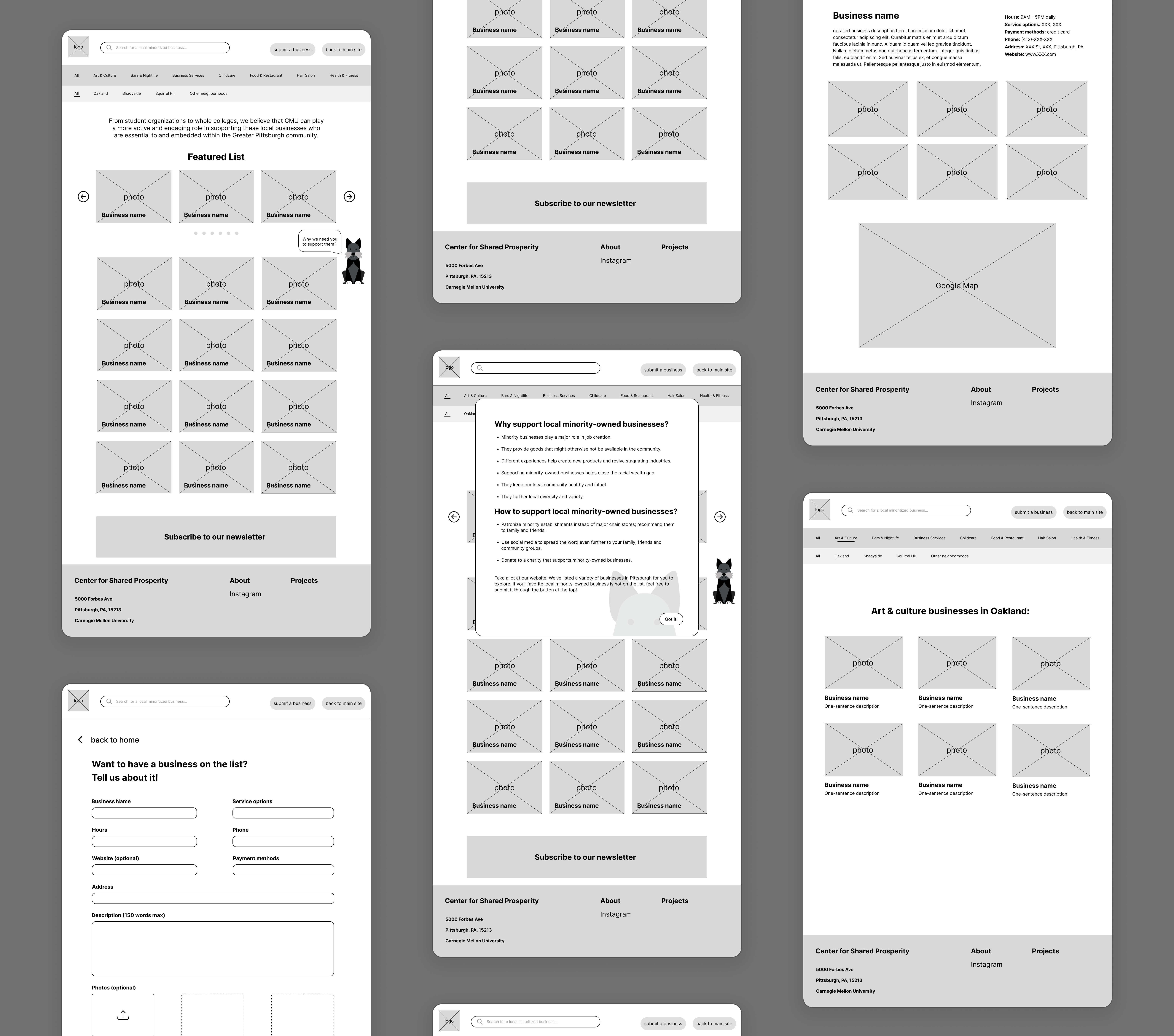
Discovering Issues
Usability Testing & Iterations
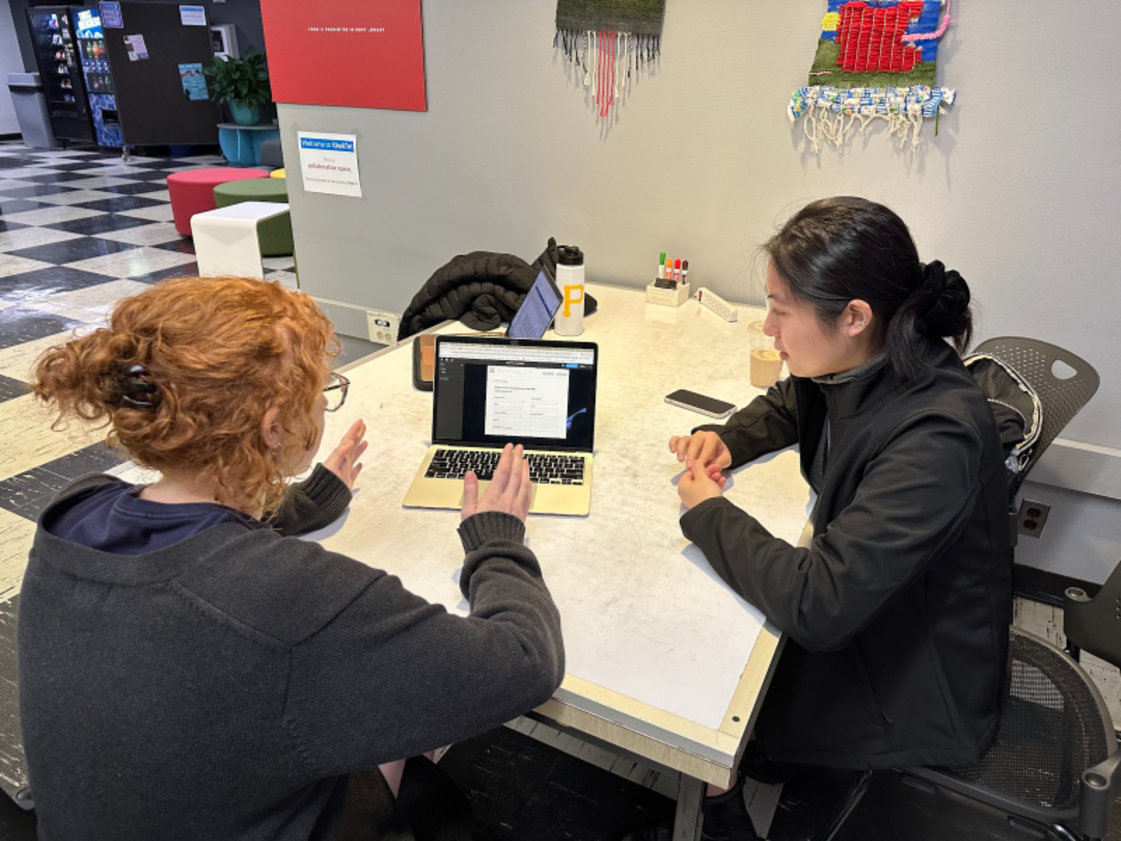
To test if our design actually fitted the needs of our target users, we tested four users from the CMU community, including 2 students, 1 faculty, and 1 staff. The testing sessions were all conducted in person. We reminded the users to always talk aloud their thought process, gave them 5 specific tasks to complete (4 simple ones and 1 complex one), and enabled them to explore the prototype on their own at the end of the sessions.
Tasks:
- Find how to submit a local minority-owned business you like.
- Then, find out how to go back to the home page.
- Find where to subscribe to the newsletter.
- Find the address of the Center for Shared Prosperity.
- Look for the first business in the Arts & Culture category in Oakland; find that business's contact number and address.
Testing Results and Tackling Problems:
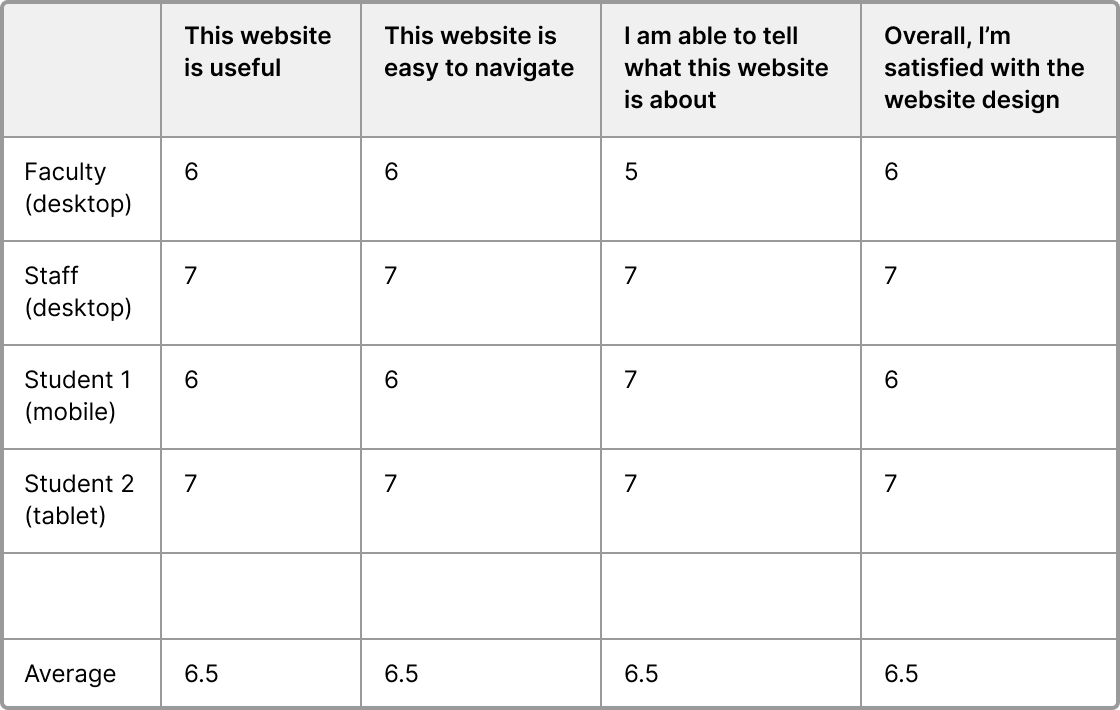
From a self-reported survey that users filled out after the testing session (1 - strongly disagree, 7 - strongly agree), we can see that users thought the design was overall satisfying with an average score for each question at around 6.5.
50%
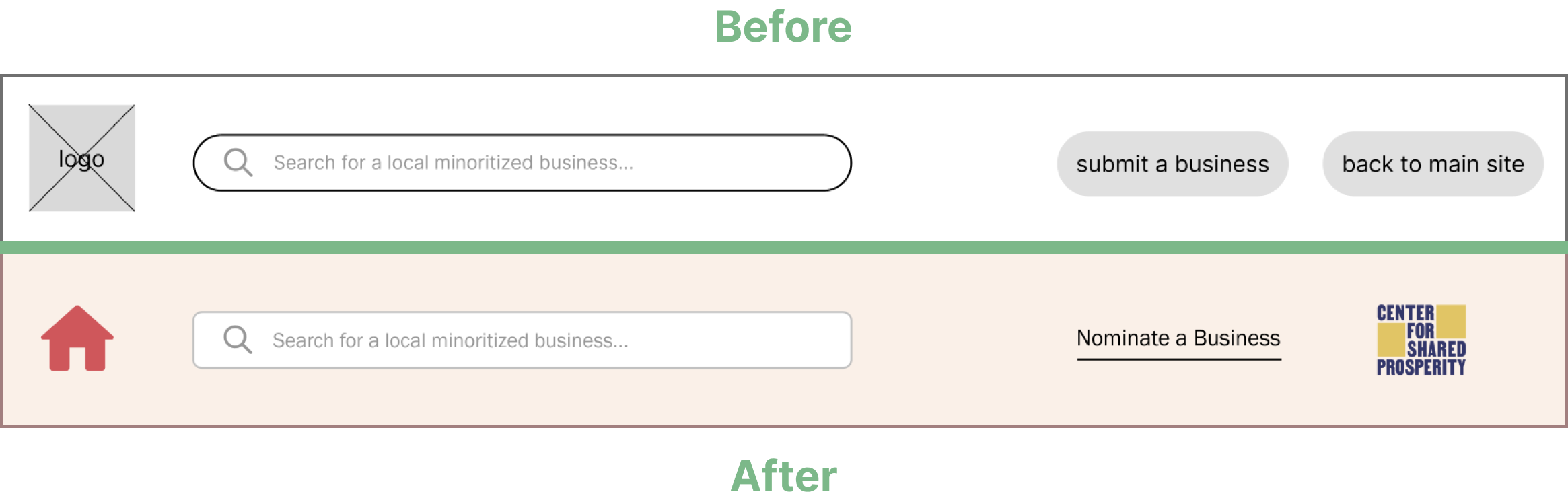
of the users mentioned they confused the logo icon with “back to main site” button. Therefore, we changed the logo icon to a home icon, and changed “back to main site” button to a CSP logo, which would lead to CSP's website.
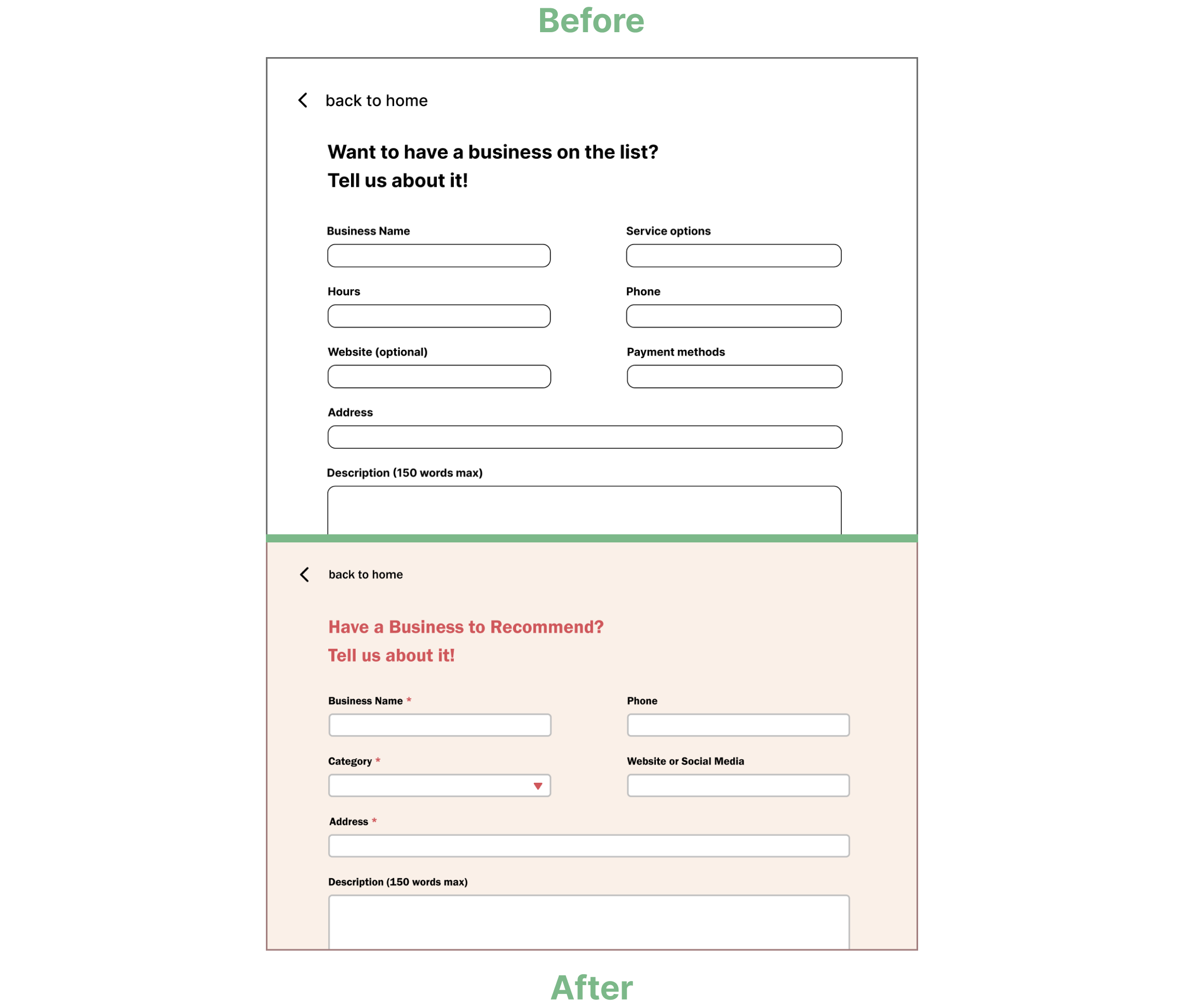
One user mentioned that the “submit a business” page was intimidating because there were too many boxes to fill out. We revised the form boxes to make the submission process easier and quicker. We also rephrased the header text to emphasize that this page was for recommending businesses.
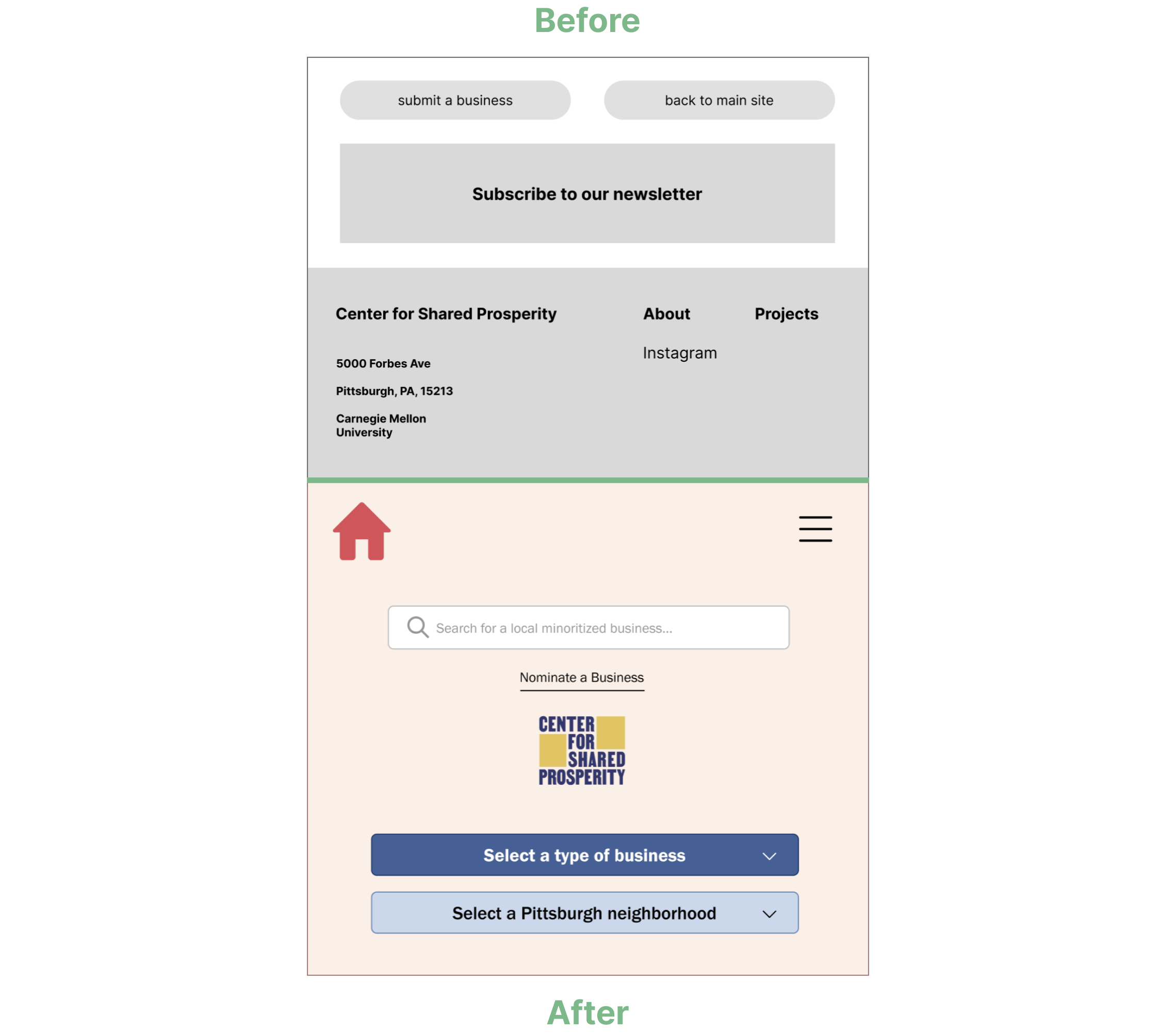
For mobile layout, 2 users reported difficulty to find where to submit a business and go back to main site as the buttons were placed at the bottom. To address this, we introduced a hamburger menu that displayed a search bar, "nominate a business," and the CSP logo when expanded. This modification also ensured consistent navigation bar layout across desktop, tablet, and mobile versions.
Hi-fi Wireframes
Reflection
This project provided me with a valuable chance to address a real client's need, turning their idea into a functional website. Designing a website using another site's brand toolkit was an interesting experience for me, and the ongoing communication with the client allowed us to transform their concept into a tangible website solution.
I also enjoyed my first time collaborating with two other members for a UX and web design project. Together, we designed a new website using user-centered approach, and combined our code to make the website actually work. Group work and user testing sessions brought so many new perspectives that I have never thought of, and it was satisfying to see our prototype gradually improving.